Tutorial 10 - Dynamic connectivity during a task#
Here, we will look at using MVAR modelling to describe changes in connectivity within a functional network as participants perform a simple button press task. This is similar to the sliding window modelling in tutorial 6
We will analyse MEG source time-courses from four regions of the AAL atlas (Precentral gyrus and supplemental motor area from left and right hemispheres) during a self-paced finger tap task from 10 participants. Each trial lasts 20 seconds with 10 seconds of finger tapping at the start and 10 seconds post movement time. Finger tapping was performed with the right hand. The MEG data were recorded on a 4D NeuroImaging WHS-3600 system and the source time-courses were generated from the data using an LCMV beamformer on data which had been band-pass filtered between 1 and 80Hz.
First, lets import sails and load in the example data. If you haven’t already done so, please download the example data repository from sails-dev/sails-example-data
We start by importing the modules we will require:
import os

import h5py
import numpy as np
import matplotlib.pyplot as plt

import sails
SAILS will automatically detect the example data if downloaded into your home
directory. If you’ve used a different location, you can specify this in an
environment variable named SAILS_EXAMPLE_DATA.
# Specify environment variable with example data location
# This is only necessary if you have not checked out the
# example data into $HOME/sails-example-data
os.environ['SAILS_EXAMPLE_DATA'] = '/path/to/sails-example-data'

# Locate and validate example data directory
example_path = sails.find_example_path()

# Load data using h5py
motor_data = h5py.File(os.path.join(sails.find_example_path(), 'fingertap_group_data.hdf5'))
The motor data is stored in hdf5 format and contains the data sample rate and
10 data arrays with the data for each participant. These can be accessed using
keys similar to a dictionary. Here, we print the keys from motor_data and
extract the sample_rate. Note that the motor_data['sample_rate'] returns a
h5py object which we can further index to extract the sample rate using
motor_data['sample_rate'][0]
# Print contents of motor_data
print(list(motor_data.keys()))

# Extract sample_rate
sample_rate = motor_data['sample_rate'][...]
print('Data sample rate is {0}Hz'.format(sample_rate))

# Define node labels
labels = ['L Precentral', 'R Precentral', 'L SuppMotorArea', 'R SuppMotorArea']
The fingertap data itself is in a 3d array of size [nchannels x nsamples x ntrials]. Every participant has 4 channels and 3391 samples in each trial but slightly different numbers of trials - around 20-30 each.
# Print shape of data array from the first participant
print(motor_data['subj0'][...].shape)
Before fitting our model we specify a time vector with the time in seconds of each of our samples.
# Specify a time vector
num_samples = motor_data['subj0'].shape[1]
time_vect = np.linspace(0, num_samples/sample_rate, num_samples)
Now we will fit our models. We first define the vector of delays to fit the
MVAR model on and a set of frequency values to estimate connectivity across. We
will compute three things for each participant: m is the LinearModel
containing the autoregressive parameters, d is a set of model diagnostics
for each mode and f is a MvarMetrics instance which we can use to compute
power and connectivity values.
We compute m, d and f for each participant in turn and store them
in a list. Please see tutorial 6 for more details on sliding_window_fit and
its options.
# Define model delays, time vector and frequency vector
delay_vect = np.arange(15)
freq_vect = np.linspace(0, 48, 48)

# Initialise output lists
M = []
D = []
F = []

# Main loop over 10 subjects
for ii in range(10):
    print('Processing subj {0}'.format(ii))

    # Get subject data
    x = motor_data['subj{}'.format(ii)][...]

    # Fit sliding window model
    sliding_window_length = int(sample_rate) # 1 second long windows
    sliding_window_step = int(sample_rate / 8) # 125ms steps between windows
    m, d = sails.sliding_window_fit(sails.VieiraMorfLinearModel, x, delay_vect,
                                    sliding_window_length, sliding_window_step)

    # Compute Fourier MVAR metrics from sliding window model
    f = sails.FourierMvarMetrics.initialise(m, sample_rate, freq_vect)

    # Append results into list
    M.append(m) # MVAR Model
    D.append(d) # Model Diagnostics
    F.append(f) # Fourier Metrics

# Get time vector for centre of sliding windows (in seconds)
model_time_vect = time_vect[m.time_vect.astype(int)]
We can extract information across participants using list comprehensions. Here, we extract the power spectral density from each participant and concatenate them into a single array for visualisation.
# Create a list of PSD arrays with a singleton dummy dimension on the end
# and concatenate into a single array
PSD = np.concatenate([x.PSD[..., np.newaxis] for x in F], axis=4)

# PSD is now [nnodes x nnodes x nfrequencies x ntimes x nparticipants]
print(PSD.shape)
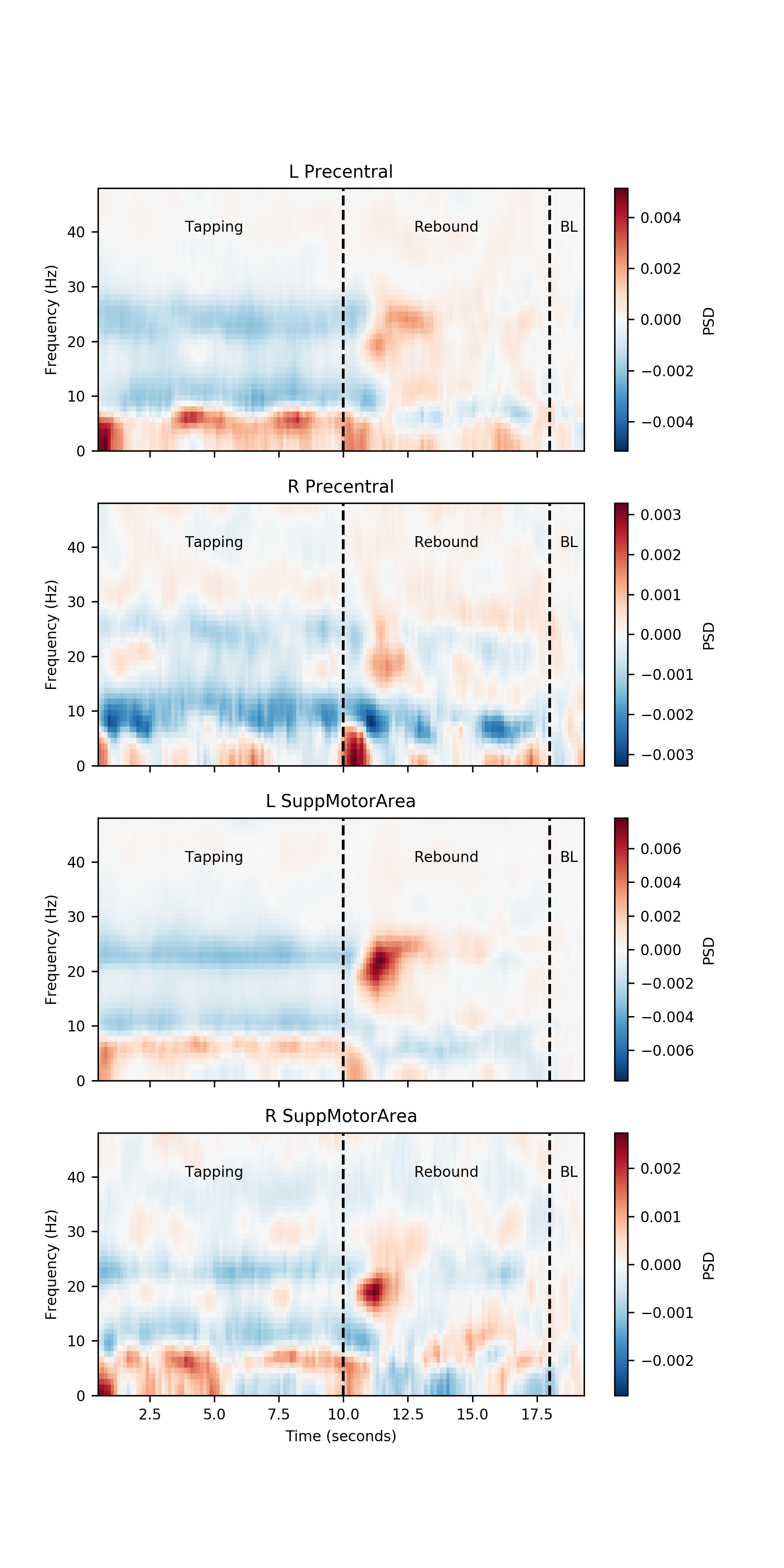
Next we visualise the time-frequency power spectral density for each of the four nodes. We perform a simple baseline correction by subtracting the average of the last 2 seconds of data from the whole trial. The resulting PSD shows the power relative to this pre-movement period. We annotate the plots with two dotted lines, one at 10 seconds to show the end of the finger-tapping and one at 18 seconds showing the start of the baseline period.
# Count the number of nodes and subjects
num_nodes = PSD.shape[0]

# Number of windows over which to calculate baseline estimate
baseline_windows = 11

# Create a new figure
plt.figure(figsize=(6, 12))

# Main plotting loop
for ii in range(num_nodes):
    # Average PSD across  participants
    psd = PSD[ii, ii, :, :, :].mean(axis=2)

    # Apply a simple baseline correction
    psd = psd - psd[:, -baseline_windows:, np.newaxis].mean(axis=1)

    # Find the max value for the colour scale
    mx = np.abs(psd).max()

    # Make new subplot and plot baseline corrected PSD
    plt.subplot(num_nodes, 1, ii + 1)
    plt.pcolormesh(model_time_vect, freq_vect, psd, cmap='RdBu_r', vmin=-mx, vmax=mx)

    # Annotate subplot
    cb = plt.colorbar()
    cb.set_label('PSD')

    # Place lines showing the period of finger tapping
    plt.vlines([10, 18], freq_vect[0], freq_vect[-1], linestyles='dashed')

    # Annotate windows
    plt.text(5, 40, 'Tapping', horizontalalignment='center')
    plt.text(14, 40, 'Rebound', horizontalalignment='center')
    plt.text(18.75, 40, 'BL', horizontalalignment='center')

    # Tidy up x-axis labelling
    if ii == (num_nodes - 1):
        plt.xlabel('Time (seconds)')
    else:
        plt.gca().set_xticklabels([])

    # Y axis labelling and title
    plt.ylabel('Frequency (Hz)')
    plt.title(labels[ii])

plt.show()
Note that the Left Precentral gyrus has a strong increase in beta power after movement has stopped. The left and right Supplemental Motor Areas have a weaker rebound.
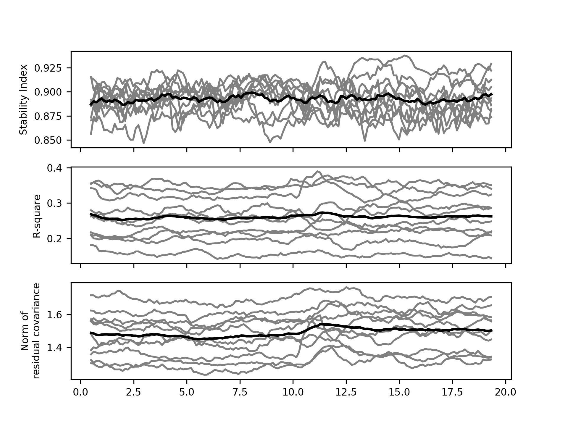
It is always good idea to inspect the model diagnostic values for an MVAR
analysis. We now extract the stability index, r-squared and residual covariances
for each participant using list comprehensions to extract data from D.
We use the np._r operator as a quick way to concatenate our lists into numpy arrays.
# Get stability index
SI         = np.r_[[d.SI for d in D]]

# Get R-square variance explained
R_square   = np.r_[[d.R_square.mean(axis=1) for d in D]]

# Get the matrix norm of the residual covariance matrices - this is a
# convenient summary of the sum-squared values in the residual covariance
# matrices.
resid_norm = np.r_[[np.linalg.norm(d.resid_cov, axis=(0, 1)) for d in D]]
A quick visualisation of these diagnostics shows that our models are stable for all participants and all time windows (SI < 1). The models explain between 15 and 40% of variance and have relatively stable residual covariances across the whole window.
plt.figure()

plt.subplot(3, 1, 1)
plt.plot(model_time_vect, SI.T, 'grey')
plt.plot(model_time_vect, SI.mean(axis=0), 'k', linewidth=2)
plt.ylabel('Stability Index')
plt.gca().set_xticklabels([])

plt.subplot(3, 1, 2)
plt.plot(model_time_vect, R_square.T, 'grey')
plt.plot(model_time_vect, R_square.mean(axis=0), 'k', linewidth=2)
plt.ylabel('R-square')
plt.gca().set_xticklabels([])

plt.subplot(3, 1, 3)
plt.plot(model_time_vect, resid_norm.T, 'grey')
plt.plot(model_time_vect, resid_norm.mean(axis=0), 'k', linewidth=2)
plt.ylabel('Norm of\nresidual covariance')

plt.show()
Now we trust that our models are capturing reasonable task dynamics within each brain region and have good diagnostics we can look at the connectivity.
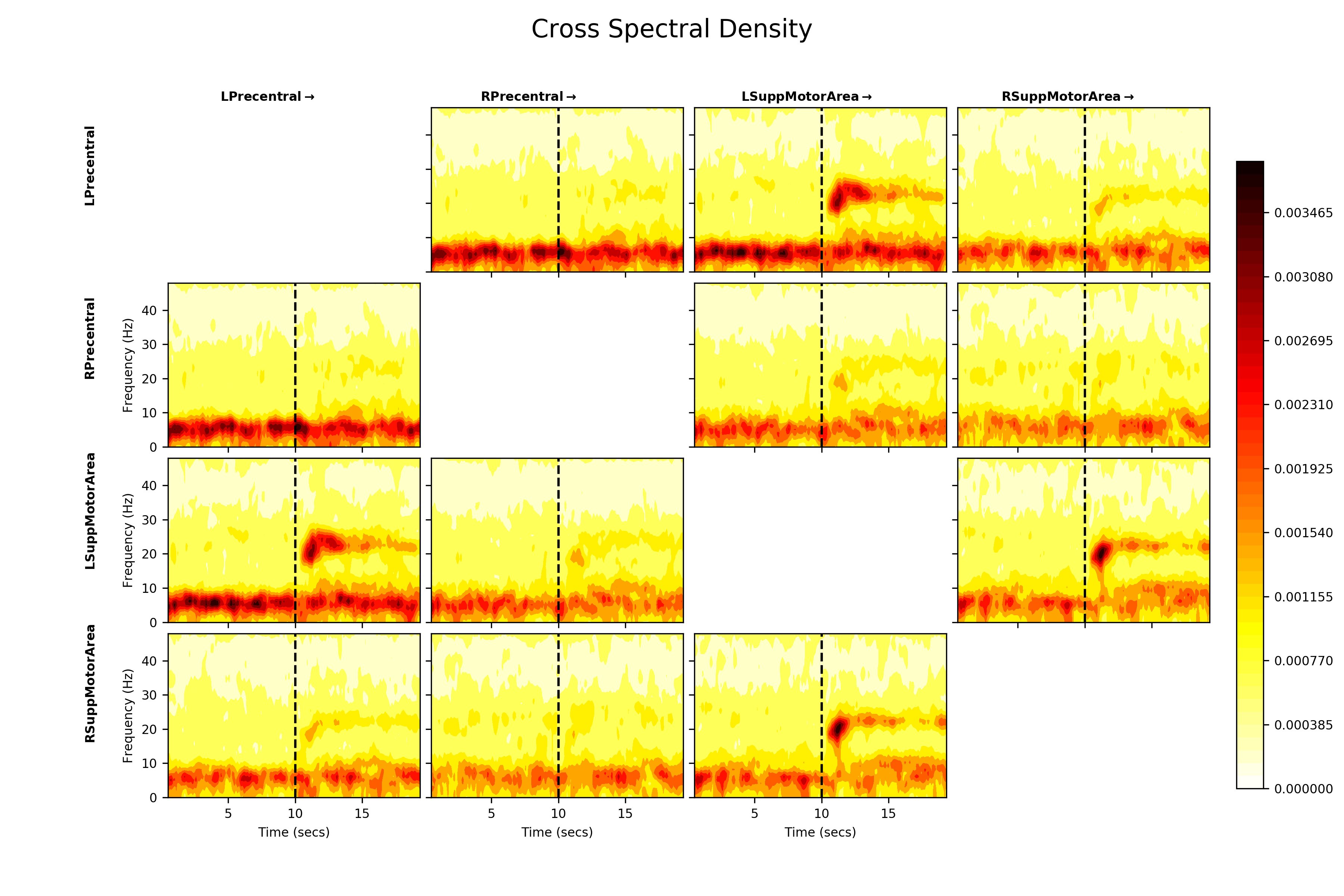
We first look at the cross-spectral densities across the network. These are the
off diagonal elements of the PSD metric. We first extract the PSD using
the list comprehension method and concatenate them into a single array. After
that, we plot the average cross spectral density for between all nodes using
sails.plotting.plot_matrix.
# Create a list of PSD arrays with a singleton dummy dimension on the end
# and convert into an array
PSD = np.concatenate([f.PSD[..., np.newaxis] for f in F], axis=4)

# Visualise
fig = plt.figure(figsize=(12, 8))
sails.plotting.plot_matrix(PSD.mean(axis=4), model_time_vect, freq_vect,
                           title='Cross Spectral Density',
                           labels=labels, F=fig,
                           vlines=[10], cmap='hot_r', diag=False,
                           x_label='Time (secs)', y_label='Frequency (Hz)')
fig.show()
The cross spectral densities show a similar post-movement beta rebound pattern to the within-node power spectral densities. Now we can also see that there is shared spectral information in the left-precentral gyrus <-> left-supplemental motor area and left-supplemental motor area <-> right-supplemental motor area connections. There appears to be strong cross-spectral densities below 10Hz between all nodes.
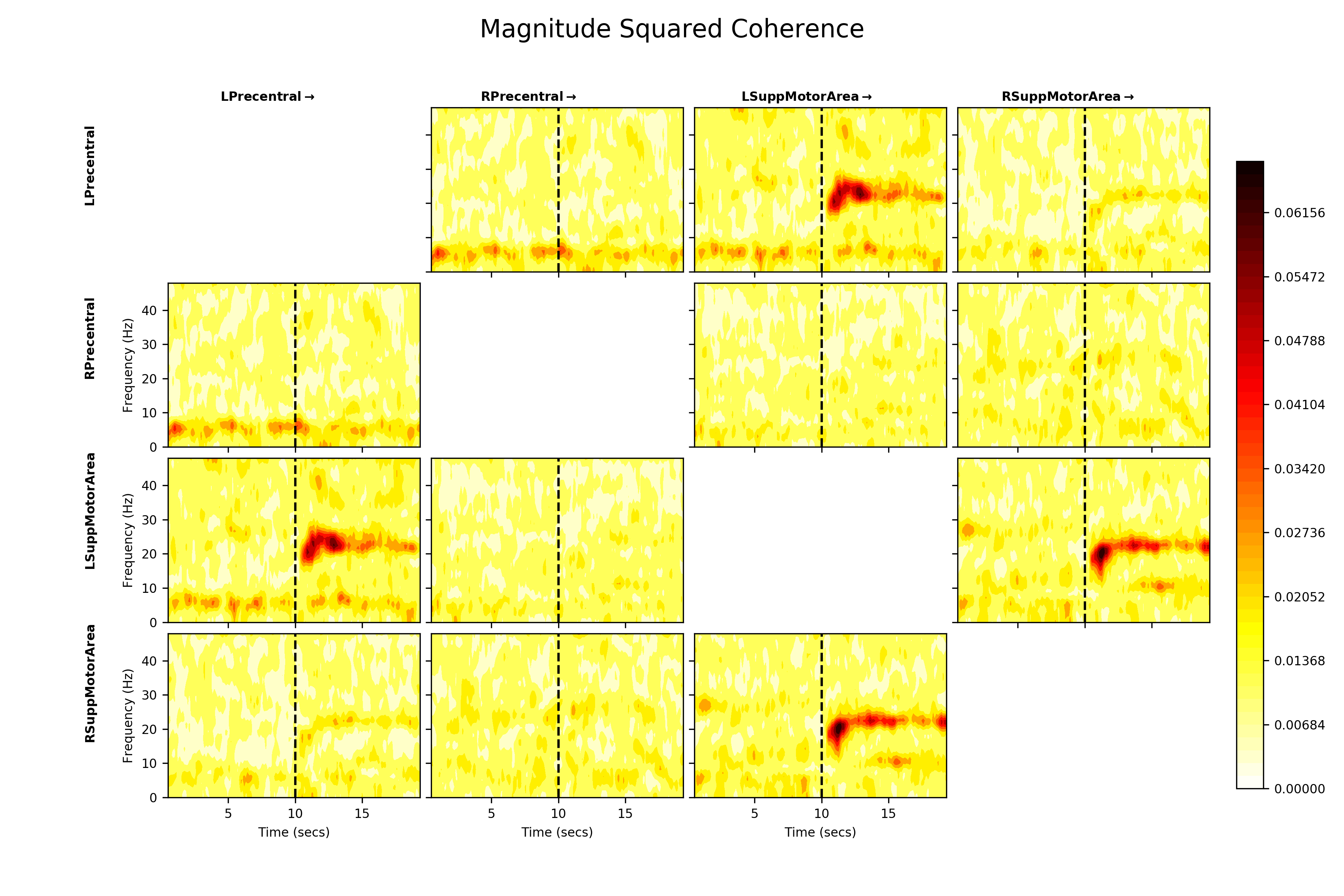
The Magnitude-Squared Coherence might be a better representation of these connections. It expresses the cross-spectral density between two nodes as a ratio of the power within each node.
# Extract the magnitude squared coherence using the list comprehension method
# and convert into a numpy array
MSC = np.concatenate([f.magnitude_squared_coherence[..., np.newaxis] for f in F], axis=4)

# Visualise
fig = plt.figure(figsize=(12, 8))
sails.plotting.plot_matrix(MSC.mean(axis=4), model_time_vect, freq_vect,
                           title='Magnitude Squared Coherence',
                           labels=labels, F=fig,
                           vlines=[10], cmap='hot_r', diag=False,
                           x_label='Time (secs)', y_label='Frequency (Hz)')
plt.show()
The normalisation emphasises the coherence within the beta rebound and strongly reduces the apparent shared power below 10Hz. This suggests that the beta cross spectral density is relatively large when compared to the power in each node at that frequency, but the <10Hz cross spectra are very low power compared to the within node power.
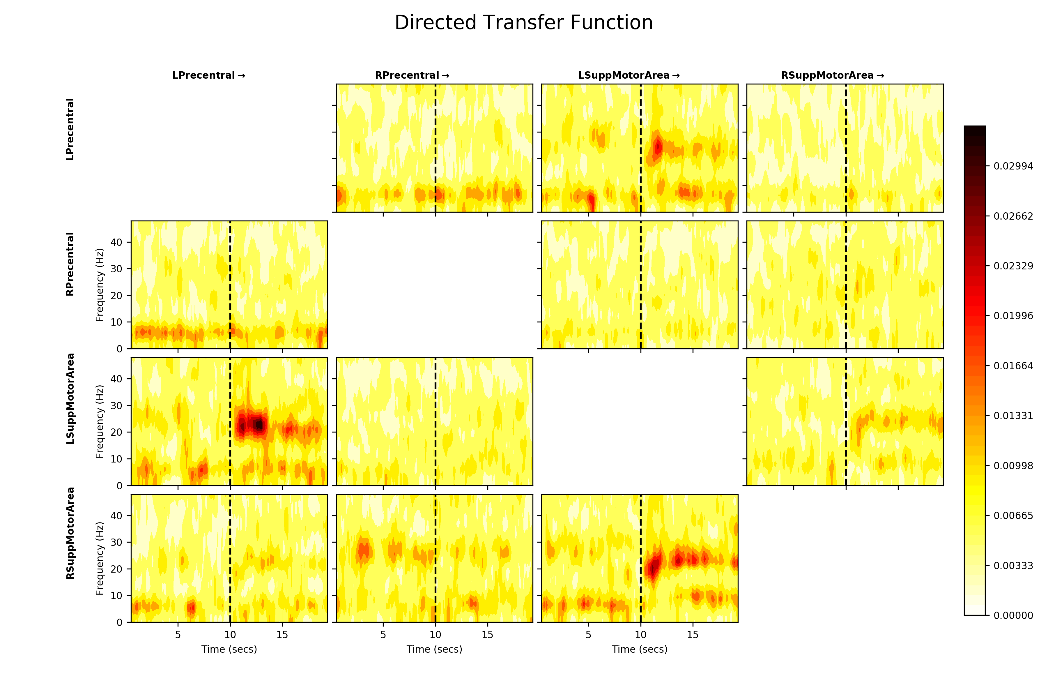
Next, we can explore whether this beta connectivity is symmetrical i.e. whether both nodes are equally influential on each other or if one node in the pair might be ‘driving’ the other. We use the Directed Transfer Function to estimate this and visualise in the same way.
# Extract the directed transfer function using the list comprehension method
# and convert into a numpy array
DTF = np.concatenate([f.directed_transfer_function[..., np.newaxis] for f in F], axis=4)

# Visualise
fig = plt.figure(figsize=(12, 8))
sails.plotting.plot_matrix(DTF.mean(axis=4), model_time_vect, freq_vect,
                           title='Directed Transfer Function',
                           labels=labels, F=fig,
                           vlines=[10], cmap='hot_r', diag=False,
                           x_label='Time (secs)', y_label='Frequency (Hz)')
plt.show()
The DTF is an asymmetrical measure, so the upper and lower triangles of the DTF plot are not symmetrical. We see similar connections in the beta band again, but the DTF additionally suggests that Left Precentral Gyrus which is driving Left Supplemental Motor Area, though there is some influence in the reciprocal direction. Similarly Left Supplemental Motor Area appears to be influencing Right Supplemental Motor Area.
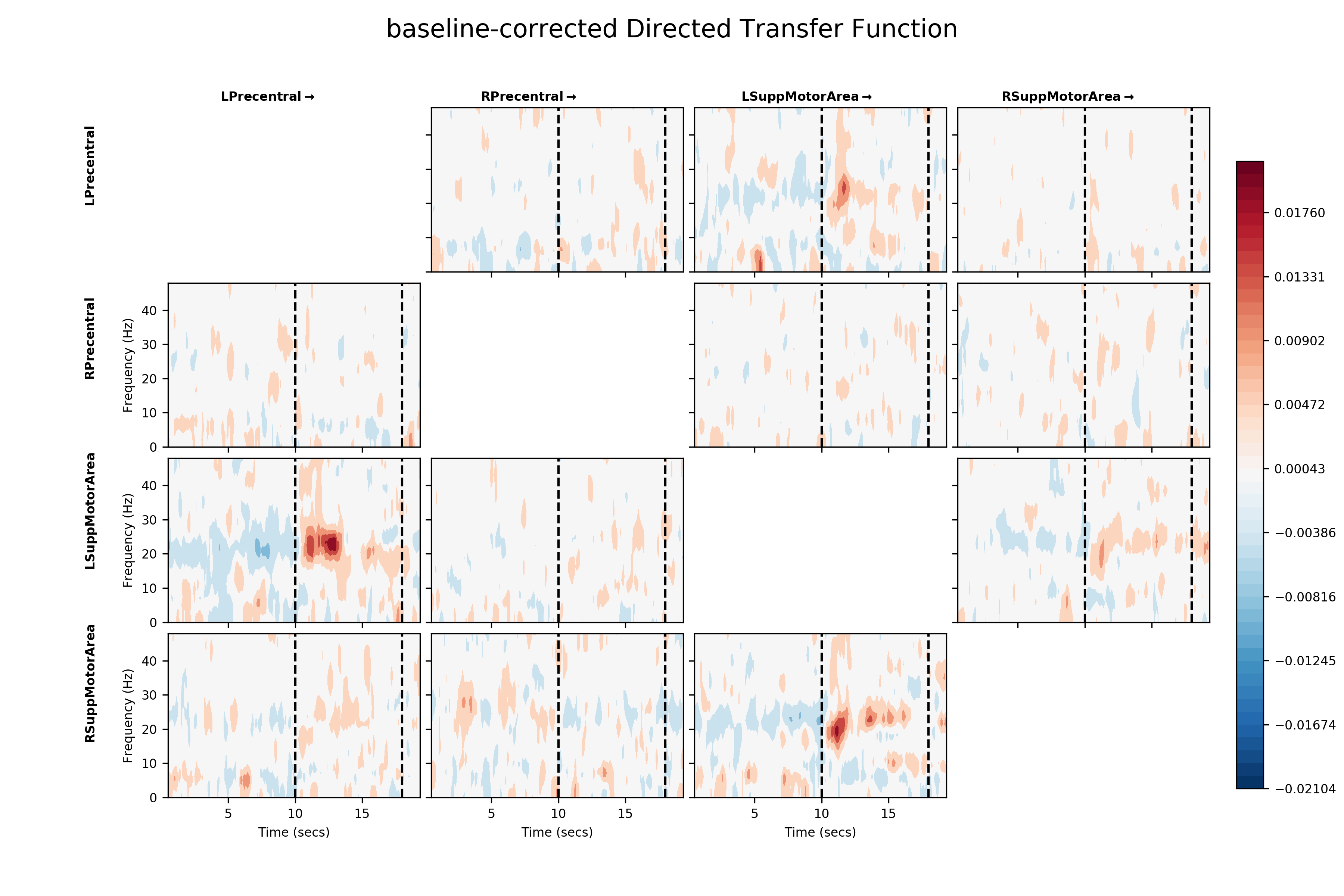
Finally, we can emphasise the change in connectivity relative to baseline by performing a simple baseline correction on the DTF values. Here, we subtract the average DTF from the last two seconds of the epoch from each time-point. Positive values then indicate a movement-evoked increase in connectivity in a connection and negative values a movement-evoked decrease.
# Number of windows over which to calculate baseline estimate
baseline_windows = 11

# Apply a simple baseline correction
bcDTF = DTF.mean(axis=4)
bcDTF = bcDTF - bcDTF[:, :, :, -baseline_windows:, np.newaxis].mean(axis=3)

# Plot baseline corrected DTF
fig = plt.figure(figsize=(12, 8))
sails.plotting.plot_matrix(bcDTF, model_time_vect, freq_vect,
                           title='baseline-corrected Directed Transfer Function',
                           labels=labels, F=fig,
                           vlines=[10, 18], cmap='RdBu_r', diag=False,
                           x_label='Time (secs)', y_label='Frequency (Hz)')
plt.show()
This baseline correction makes the change in directed functional connectivity during the post-movement beta rebound much clearer. It also reveals the fact that the relationship between the two supplementary motor areas appears to be driven by the left SMA. Given that this is a right-hand movement task, this could potentially be interpreted as a form of inhibitory signal from the left to the right hemisphere. Further data and analysis would be necessary to fully establish the nature of such a signal.