Tutorial 9 - Modal decomposition of a simulated system
One of the main features of SAILS is the ability to perform a modal decomposition on fitted MVAR models. This tutorial will outline the use of modal decomposition on some simulated data. This example is included as part of an upcoming paper from the authors of SAILS.
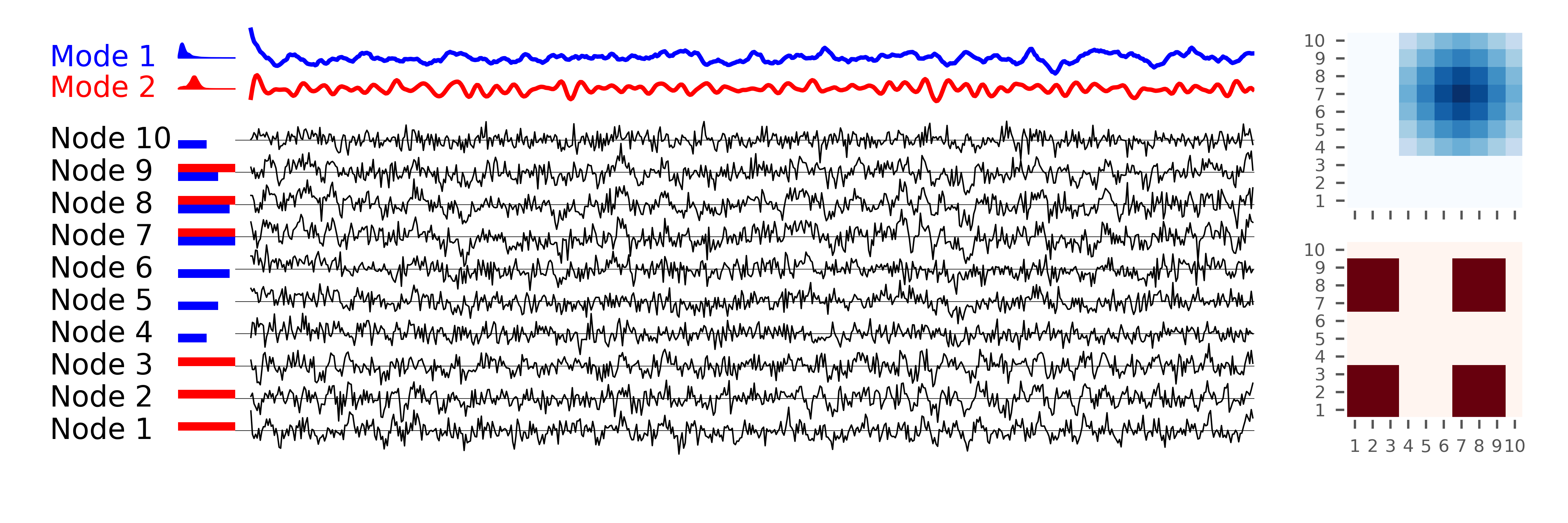
The system which is being simulated consists of 10 “nodes”. Each node is made up of a mixture of two components, each of which is distributed differently amongst the nodes. We start by simulating the data for a single realisation:
import numpy as np
import scipy.signal as signal
import matplotlib.pyplot as plt

import sails

plt.style.use('ggplot')

# General configuration for the generation and analysis
sample_rate = 128
num_samples = sample_rate*50

f1 = 10
f2 = 0

siggen = sails.simulate.SailsTutorialExample()

num_sources = siggen.get_num_sources()
weight1, weight2 = siggen.get_connection_weights()

# Calculate the base signals for reference later on
sig1 = siggen.generate_basesignal(f1, .8+.05, sample_rate, num_samples)
sig2 = siggen.generate_basesignal(f2, .61, sample_rate, num_samples)

sig1 = (sig1 - sig1.mean(axis=0)) / sig1.std(axis=0)
sig2 = (sig2 - sig2.mean(axis=0)) / sig2.std(axis=0)

# Generate a network realisation
X = siggen.generate_signal(f1, f2, sample_rate, num_samples)
At this point the variable X contains the simulated data. We start by visualising this data. sig1 and sig2 contain the base signals which are used for visualistion purposes only. Finally, weight1 and weight2 contain the connection weights (the amount to which each signal is spread across the nodes).
Next we visualise the system before fitting our model. This section of the code is for plotting purposes only and can be skipped if you are happy to just examine the plot following it.
# Calculate the Welch PSD of the signals
f, pxx1 = signal.welch(sig1.T, fs=sample_rate, nperseg=128, nfft=512)
f, pxx2 = signal.welch(sig2.T, fs=sample_rate, nperseg=128, nfft=512)

# Visualise the signal and the mixing of it
x_label_pos = -2.25
x_min = -1.75
plot_seconds = 5

plot_samples = int(plot_seconds * sample_rate)

# Plot the two base signals
plt.figure(figsize=(7.5, 2.5))
plt.axes([.15, .8, .65, .15], frameon=False)
plt.plot(sig1[:plot_samples], 'r')
plt.plot(sig2[:plot_samples] + 7.5, 'b')

plt.xlim(-10, plot_samples)
yl = plt.ylim()
plt.xticks([])
plt.yticks([])

# Add labelling to the base signals
plt.axes([.05, .8, .1, .15], frameon=False)
plt.text(x_label_pos, 7.5, 'Mode 1', verticalalignment='center', color='b')
plt.text(x_label_pos, 0,   'Mode 2', verticalalignment='center', color='r')

plt.xlim(x_label_pos, 1)
plt.ylim(*yl)
plt.xticks([])
plt.yticks([])

# Add a diagram of the Welch PSD to each signal
plt.fill_between(np.linspace(0, 2, 257), np.zeros((257)), 20 * pxx1[0, :], color='r')
plt.fill_between(np.linspace(0, 2, 257), np.zeros((257)) + 7.5, 20 * pxx2[0, :]+7.5, color='b')
plt.xlim(x_min, 1)

# Plot the mixed signals in the network
plt.axes([.15, .1, .65, .7], frameon=False)
plt.plot(X[:, :plot_samples, 0].T + np.arange(num_sources) * 7.5, color='k', linewidth=.5)
plt.hlines(np.arange(num_sources)*7.5, -num_sources, plot_samples, linewidth=.2)
plt.xlim(-num_sources, plot_samples)
plt.xticks([])
plt.yticks([])
yl = plt.ylim()

# Add labelling and the weighting information
plt.axes([.05, .1, .1, .7], frameon=False)
plt.barh(np.arange(num_sources)*7.5+1, weight1, color='r', height=2)
plt.barh(np.arange(num_sources)*7.5-1, weight2, color='b', height=2)
plt.xlim(x_min, 1)
plt.ylim(*yl)
for ii in range(num_sources):
    plt.text(x_label_pos, 7.5 * ii, 'Node {0}'.format(ii+1), verticalalignment='center')
plt.xticks([])
plt.yticks([])

# Plot the mixing matrices
wmat1, wmat2 = siggen.get_connection_weights('matrix')

plt.axes [.85, .6, .13, .34])
plt.pcolormesh(wmat2, cmap='Blues')
plt.xticks(np.arange(num_sources, 0, -1) - .5, [''] * num_sources, fontsize=6)
plt.yticks(np.arange(num_sources, 0, -1) - .5, np.arange(num_sources, 0, -1), fontsize=6)
plt.axis('scaled')

plt.axes([.85, .2, .13, .34])
plt.pcolormesh(wmat1, cmap='Reds')
plt.xticks(np.arange(num_sources, 0, -1)-.5, np.arange(num_sources, 0, -1), fontsize=6)
plt.yticks(np.arange(num_sources, 0, -1)-.5, np.arange(num_sources, 0, -1), fontsize=6)
plt.axis('scaled')
Next we fit an MVAR model and examine the Modal decomposition:
model_order = 5
delay_vect = np.arange(model_order + 1)
freq_vect = np.linspace(0, sample_rate/2, 512)

# Fit our MVAR model and perform the modal decomposition
m = sails.VieiraMorfLinearModel.fit_model(X, delay_vect)

modes = sails.MvarModalDecomposition.initialise(m, sample_rate)

# Now extract the metrics for the modal model
M = sails.ModalMvarMetrics.initialise(m, sample_rate,
                                      freq_vect, sum_modes=False)
Each mode in the decomposition consists of either a single pole
(where it is a DC component) or a pair of poles (where it is
an oscillator). We can extract the indicies of the pole pairs
using the `mode_indices` property. Given the nature of
our simulation, we would expect to find one DC pole and one
pole at 10Hz with a stronger effect than all other poles.
For the purposes of this tutorial, we are going to set an arbitrary
threshold on the modes; in reality a permutation testing scheme
can be used to determine this threshold (which will be the
subject of a future tutorial).
# For real data and simulations this can be estimated using
# a permutation scheme
pole_threshold = 2.3

# Extract the pairs of mode indices
pole_idx = modes.mode_indices

# Find which modes pass threshold
surviving_modes = []

for idx, poles in enumerate(pole_idx):
   # The DTs of a pair of poles will be identical
   # so we can just check the first one
   if modes.dampening_time[poles[0]] > pole_threshold:
      surviving_modes.append(idx)

# Use root plot to plot all modes and then replot
# the surviving modes on top of them
ax = sails.plotting.root_plot(modes.evals)

low_mode = None
high_mode = None

for mode in surviving_modes:
   # Pick the colour based on the peak frequency
   if modes.peak_frequency[pole_idx[mode][0]] < 0.001:
       color = 'b'
       low_mode = mode
   else:
       color = 'r'
       high_mode = mode

   for poleidx in pole_idx[mode]:
      ax.plot(modes.evals[poleidx].real, modes.evals[poleidx].imag,
              marker='+', color=color)
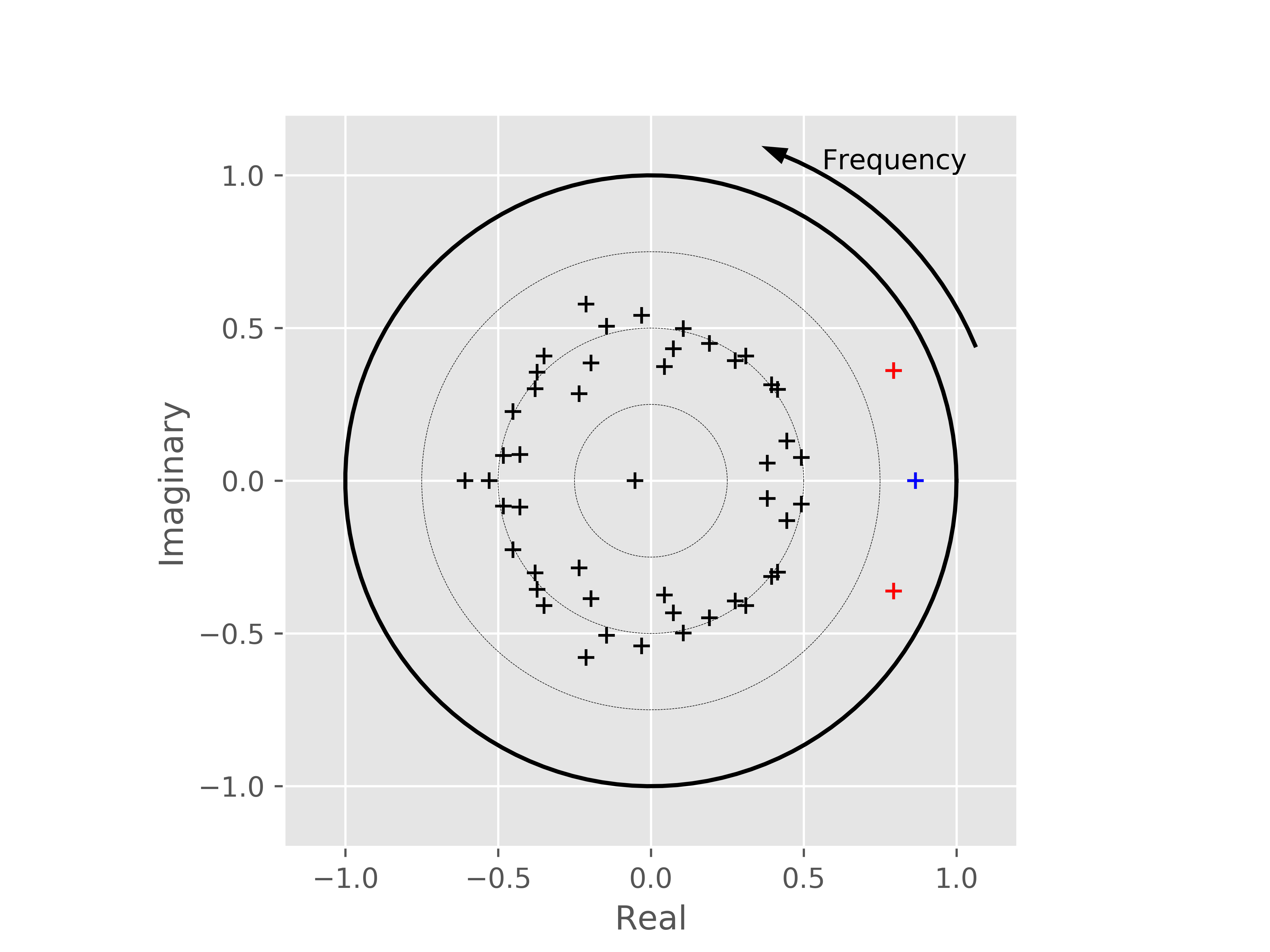
From this, we can see that the modal decomposition has clearly extracted a set of poles of importance. We can now visualise the connectivity patterns for these modes as well as their spectra:
# The frequency location simply acts as a scaling factor at this
# point, but we pick the closest bin in freq_vect to the
# peak frequency of the mode

low_freq_idx = np.argmin(np.abs(freq_vect - modes.peak_frequency[pole_idx[low_mode][0]]))
high_freq_idx = np.argmin(np.abs(freq_vect - modes.peak_frequency[pole_idx[high_mode][0]]))

# We can now plot the two graph
plt.figure()

low_psd = np.sum(M.PSD[:, :, :, pole_idx[low_mode]], axis=3)
high_psd = np.sum(M.PSD[:, :, :, pole_idx[high_mode]], axis=3)

# Plot the connectivity patterns as well as the spectra
plt.subplot(2, 2, 1)
plt.pcolormesh(low_psd[:, :, low_freq_idx], cmap='Blues')
plt.xticks(np.arange(num_sources, 0, -1)-.5, np.arange(num_sources, 0, -1), fontsize=6)
plt.yticks(np.arange(num_sources, 0, -1)-.5, np.arange(num_sources, 0, -1), fontsize=6)

plt.subplot(2, 2, 2)
for k in range(num_sources):
   plt.plot(freq_vect, low_psd[k, k, :])

plt.subplot(2, 2, 3)
plt.pcolormesh(high_psd[:, :, high_freq_idx], cmap='Reds')
plt.xticks(np.arange(num_sources, 0, -1)-.5, np.arange(num_sources, 0, -1), fontsize=6)
plt.yticks(np.arange(num_sources, 0, -1)-.5, np.arange(num_sources, 0, -1), fontsize=6)

plt.subplot(2, 2, 4)
for k in range(num_sources):
   plt.plot(freq_vect, high_psd[k, k, :])

plt.xlabel('Frequency (Hz)')
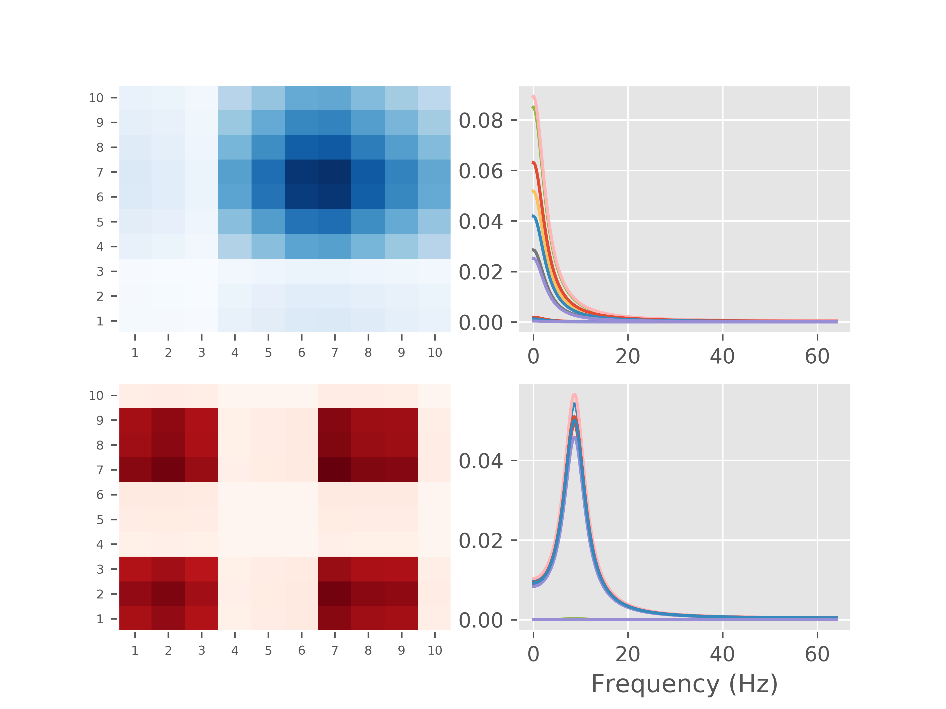
In this tutorial we have demonstrated how to use the modal decomposition functionality in SAILS to decompose the parameters of an MVAR model and then to extract spectral and connectivity patterns from just the modes of significance. This approach can be extended across participants and, with the additional use of PCA, used to simultaneously estimate spatial and spectral patterns in data. More details of this approach will be available in an upcoming paper from the authors of SAILS.